


Table of contents
If my past posts haven't suggested it already, I am a very technical person. I struggle a lot with the intricacies of product/visual/brand design. Being a solo founder, it's something I had – and still have – to work on improving. A logo is one of the most important things for brand and product visibility, and what you end up creating will have a big impact on how people view your product going forward. Things like color, shape, size, its complexity, and the way users perceive your product at first glance, first impressions are everything. Have you ever been searching for a job and saw a company whose logo really didn't inspire you to apply, even though you knew nothing about that company? That's the brand power of a logo at work.
The most difficult thing is: once you've made these decisions, they are very difficult to change. If people start to associate your logo to your product, changing it will mean losing that association. At the small startup scale, that can be devastating. For example, a few years ago I wanted to look up tipe.io (now defunct I believe) and only remembered their amazing cat logo. In the end, I couldn't find them and I ended up using another CMS.
All this to say, as a technical person, that was a big wall to scale. It was also a wall that I knew I couldn't scale the wrong way, it could hurt my brand in the long term and I couldn't afford that. That taught me a lot and, for the fourth post in the 4articlesin4weeks writeathon, I would like to share the story of my process for designing a second logo for a small side-project called HeaDB.
Define the product?
There are many ways of designing a logo and a brand, but I find that a combination of a product description and a mood-board works the best for my very technical mind.
I find descriptive logos, logos that clearly show the product they try to represent in their design, to be the easiest to create as a developer. That can take the form of a text logo with the name of the product (eg. Coca Cola), a logo that represents the name of your product (eg. RabbitMQ's rabbit), or a common mascot doing something related to your product (eg. all the products for Golang using the Gopher mascot). They can also be more abstract by using some imagery related to your product, like PostgreSQL elephant (Elephants have long memories) or a robot for any kind of bot. Lastly, if your product has a short name, the first letter of that name can work great for visibility (Savoir's logo was initially just a yellow "S").
If you’re going the descriptive route, it’s important to define what the visual identity of your product should be. Describing the product directly is one way to look at it, but a descriptive logo doesn't have to be directly related to your product. You may want to describe the usage of your product (which can make your product more visible for developer tools for example), or the technical design of your product, or even the emotions you want your users to feel when using the product. Try thinking outside the box and letting your imagination flow, it's more than okay if you end up with multiple descriptions. In my case, HeaDB is a headless database, so I started brainstorming some descriptions: it's a database; it's meant to be used through any HTTP client only; it should make things a lot easier for users who want to prototype something; it's built in Go.
Once I have a good idea of what I want to describe, I go on Google image search and start typing general search terms for logos and what I want to describe to create a mood board. A mood-board is a set of images or other assets intended to show the general idea of a style or design. There are processes on how to design a mood-board, but I find that a general google image search works really well. At this stage, I recommend searching images for all the descriptions your brainstormed, wait until you start sketching to choose which description you like the most.
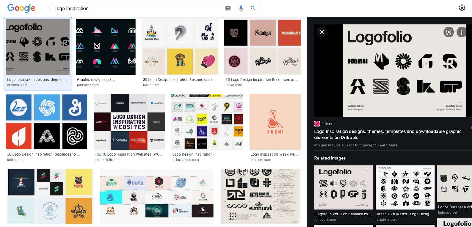 I am very original in my search terms
Whenever I find something I like on Google image search, I open a new tab and download it in a folder on my computer. That way, I can go to that folder and use my OS preview to get a good idea of the inspiration I found. I think following the suggested images on Google works a lot better than searching with terms directly, especially when I don’t exactly know how to write what I am searching for. Once I find something I like on a general search, I click on it and Google will show similar images on the right. I follow these threads of related images a lot to find inspiration.
Sketch it out
As the image below will show, I am very bad at drawing. When I started doing brand design for Savoir, I was sure my inability to draw well would work against me. Turns out being able to draw is not that important when sketching logos. Why? A sketch is just that - a sketch. It's meant to convey the visuals you have in mind, but it doesn't have to be, and shouldn't be, perfect. At this stage, you are not designing the final logo, but rather taking your mood-board inspiration and descriptions, and sketching whatever comes to mind. Once you have an idea of which sketch you prefer, then you can start making it look good.
I sketch logos by taking small sheets of paper and drawing logos on them in ink. The ink part makes sure that I do not second guess myself and erase things, it helps me focus on drawing over being a perfectionist. Each sketch takes about 30 seconds to a minute. I draw whatever comes to mind and if it looks bad or I make a mistake, I try again. I sometimes assign a "theme" to each sheet and draw ideas related to that theme. What's important here, in my opinion, is to draw as much as possible. Put ideas on paper. Try recreating a logo from the Internet and modify it to make it your own (I do that a lot, though make sure you’re not infringing on copyright). Once I'm done, I usually have 60 to 80 sketches, most of them unusable. Here are a few examples:
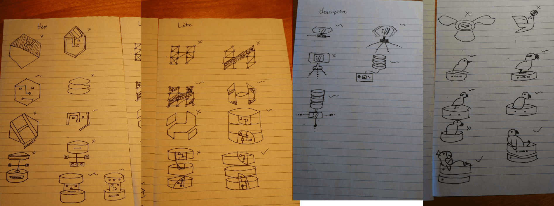
Now that I have a bunch of sketches, I go over them and choose which ones look good and which one looks bad. I don't really have a system for it, sometimes I give scores, other times I circle the ones I like. In the image above, I used a check, a tilde and a cross to represent "good", "okay", and "bad" respectively. For HeaDB, I had a few ideas and, while I had a pretty cool concept going with the "Database server with 'insets' showing the internals and drawing a sort of H" thing, the parrot using a DB server as a pool/bed really stuck with me. I'm a big fan of CouchDB and its branding, and the chill parrot really makes me feel like this database is going to help me relax at night.
Put it together
This is the point where I have to go out of my comfort zone and start designing. I can’t sketch forever, so now I have to take the sketches I like and create an SVG logo from them. Something I can play and tinker to my heart's content. And well, I am not great at it. Inkscape is the best tool I've found for my skill level. It runs well, it's free, and it has all the tools I need without overwhelming me with possibilities. I've watched countless tutorials and I managed to create some okay looking assets in Inkscape, which is something I can't say about Figma or Adobe Illustrator.
As a technical person, I think the most important thing when moving from sketches to SVG is to meet yourself where you are. Don't try to make it perfect from day 1, if the visual identity of your logo is well defined, then you can tinker with the logo as you get better. In fact, I am currently going through the process of hiring a designer to help me fix Savoir’s logo and branding assets. Being rigorous in the process to find the visual identity of your logo is important, as said earlier, it will be hard to change if people start associating it with your product. That rigor is not as important once that visual identity is decided. It will be if you want your logo to look professional, but when getting started, it's okay if things aren't perfect.
Going back to Inkscape, my workflow is to create a bunch of assets with the circle, path, and rectangle tools. I edit the points that form the paths, add new ones, and change their orientation to create the shapes I want. My SVGs are extremely unoptimized, but that's a future-me problem. For now, I want my vision brought to life. For the HeaDB logo, I started by drawing the parrot and Database server independently. The parrot and its wing was made with rectangles and circles that I converted to paths and shaped by changing each point. The database server was a lot harder to make with my skills, I drew custom paths and did my best with copy/paste to make it look good. Don't be afraid to reuse assets or get inspiration from the Internet. I like to add images in the background of Inkscape and draw paths over it when I'm unsure how to draw something from scratch.
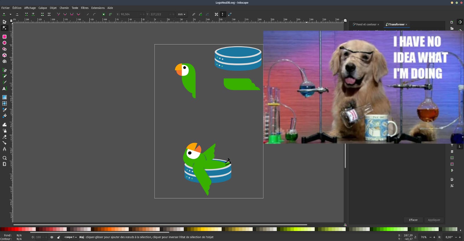
In this image, you can see the individual assets, which I used to start creating the final logo. I grouped a few things together (Shift+Click to select multiple paths, then Right click+Group to group) to make resizing and rotating easier, then I combined all the assets and played with layers to make sure everything ended up in the right position. I recently discovered the layers panel and it makes moving elements up and down the hierarchy a lot easier: "Layers" menu -> "Layers and Objects" to show the panel. The shadows on the logo are a copy of the wings or body of the parrot, which I then edited to change their color and opacity. Works pretty well.
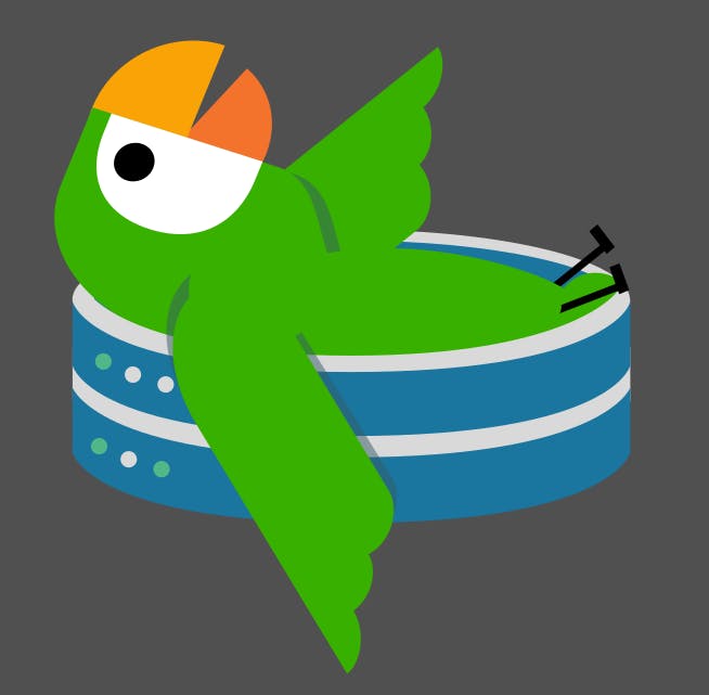
For someone with no experience in design, I think it turned out pretty good. The logo seems a bit empty and the parrot’s body curve isn't right, though. That's a result of how I arrange my workflow. I copied the parrot’s body, rotated it, then moved it “inside” the database server, without curving it to account for the fact that the parrot is not standing straight. Zooming back, it doesn’t look that great. In a stroke of "genius", while trying to fix the belly, I thought "Maybe a martini would look good?" and proceeded to add a small martini to the parrot.
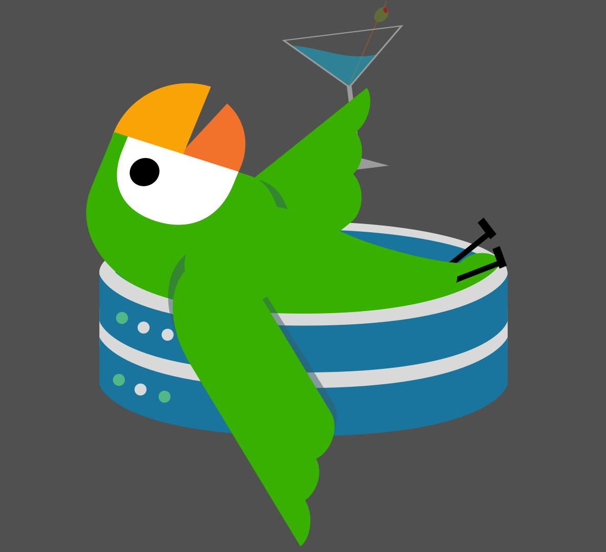
It does look better, but it also looks like the parrot is totally drunk and doesn't know what it's doing in a database server. The attention is also more on the parrot itself than the fact that it's relaxing in a database server. Still, I'm very happy with where I ended up leaving this project. I'll let it sit for a while and come back to it later.
Logo design definitely hasn't gotten easier, but I hope this story and the tips will help you start your design journey. Please let me know in the comment if you have any other tips for developers trying to do some design work, I'd love to learn more.